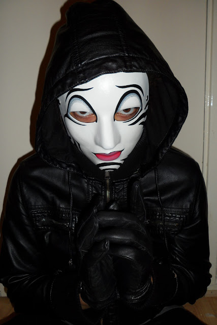
This is the original image that was used to create my magazine front cover.
This is my final design for my first ancillary task. I created my task on Photoshop CS3 Extended. Everything on the magazine was made by myself from scratch. The image took a lot of planning because not only did I need the right look for the character in the movie but I really needed it to be photo that could also be featured on a magazine. I took a series of photographs of myself in order to get the right angle. I wore a black hoodie, black leather gloves and the mask that will be featured in the movie. I had to manipulate this image quite a bit on photoshop. The image that was originally taken was very bright. I needed to make myself look darker, scarier. I needed to make an image that tied in with the genre of my trailer. I based the colours of the magazine around the colour of the mask. The main colours on the mask are black, white and red. My magazine is usuually meant ot have three main colours, so I decided to with these. The first part of editing that I did was making myself look dark. I did this by darkening the brightness on the image, darkening all the bright spots on my jacket so there is no longer shine and darkening the flesh coloured parts underneath my eyes. Darkening my eyes was the main feature that chanegd the whole look. Immediately the image look scarier, just the look I wanted to create. I wanted to brighten the mask and darken the surrouding areas, so that the image would immediately catch the audience's attention. The expression on the mask spoke for itself as I added a red colour that acted as blood on the mask so highlight the genre to the audience even further. Behind the photograph, I didn't want to leave it blank as it would be a bright colour and it would take away the shine from the main image featured. I created blood on the 'wall' behind the image to present it's darker tone. This made it look more like a set that had been photographed on. This also matched the blood around the mouth.
The title of the magazine is an original movie magazine named TotalFilm. However, I manipulated an original red background filled title into something that looked a little more dark and scary. I made cracks in the lettering as it tied in and complimented the theme I had aleady created with the mask, blood etc.
For the name of the movie incorporated into the kicker, I tried to make it stand off the page/stand out a little from the rest. This meant that I not only had to change the style of the wrtiing but I had to make it the same as 'The Intruder' would be written where ever it was featured. It would be the trademark writing for the movie. To make the writing a little scary, suspenseful I used a wind feature where the writing looks smugded, also in flame. This also helped to tie in with the themes I had already created on the magazine. All the features that I put on the magazine including other straplines, the pug etc had to fit in with the colour scheme in order to keep the image the main feature on the front cover. This meant it had to follow suit and be either red, white or black.


No comments:
Post a Comment